If you look at all of Wilson's fastballs combined (cutters, 4-seamers, etc. all added together, skirting around most pitch classification problems), he is averaging 91.06 MPH so far in 2013 with 1.51 horizontal movement. In 2012, they averaged 91.81 MPH with a 1.59 horizontal movement. In 2011, his fastballs averaged 1.6 horizontal movement and 91.17 MPH. If you are looking for a dramatic loss of stuff for Wilson, then you need to look at something other than fastballs. We could break down the breaking pitches pretty easily, but instead, let's look at Wilson's release point to see if this gives us any insight into his command.
When looking at his release point data for his career, I noticed that he has come more "out", going from having his arm when it releases the ball about 1 feet from the center of the rubber/plate to about 2 feet in 2013. This started happening in August of 2012 so I decided to look at pictures (screenshots I took of highlights) and release point Pitch F/X data.
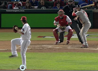
Here is C.J. Wilson in the World Series in 2011:
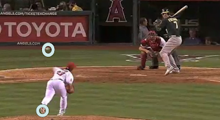
Here is C.J. in August of 2012:
The shots are at a little bit different times in the delivery and the 2012 photo is not zoomed in as much, but (especially if you zoom in) it seems that he has moved on the rubber closer to the 1st base side. Other than that, the body angle, posture, stride, and arm angle look the same to me. So it seems that he has simply moved on the rubber.
Let's look at the numbers to see if this changed how consistently he repeated his delivery.
2011: Horizontal SD: .214. Vertical SD: .192
2012 before he changed his stance on the rubber:
Horizontal SD: .211. Vertical SD: .1711
After he changed: Horizontal SD: .15578. Vertical SD: .1686
We wouldn't expect the vertical to change much, but it seems he has gotten more consistent at how high he is releasing the ball. He also improved horizontally, going from a horrible number to one that is a little more manageable.
In graph form, here is 2011:
Here is 2012 on a whole:
Here is C.J. after the change in 2012:
Obviously the further out part of his overall 2012 graph was simply his move on the rubber, which makes his year on a whole look worse. So the sample size was smaller, so we should be careful, but Wilson did repeat his delivery better after the change. Let's look at 2013 so far.
In picture form:
In Number form:
Horizontal: .207. Vertical: .1688
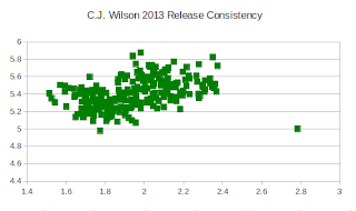
He is basically went back to his old horizontal inconsistencies, while his vertical release has remained better than it was. That is sort of a weird find, as we would expect the horizontal to be the one that is affected the most.
In Graph Form, here is the zoomed in version:
The larger view (like the other graphs above):
From a numbers perspective Wilson (small sample size alerts apply for early 2013 obviously) has not gotten better. His stuff seems to be more or less the same from 2010-2011, and he seems to be repeating his delivery at least a little better. So we are left with three choices in my view, 1) This data suggests he should get a little better, 2) He may be a little more consistent at repeating his delivery, but the move on the rubber is a negative thing and cancelling out any benefit or 3) It is some other variable that we are not considering. He is pitching in the same division, against similar opponents, and while yes he is older, the stuff seems to be there. I could be missing something, but I can't quite figure this one out.


No comments:
Post a Comment